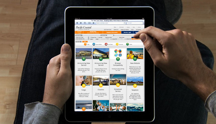
Pacific Coastal Airlines new Digital Foot Print
Pacific Coastal has been a long-time client of ours and we are very pleased to announce the launch of their new website. One of the key strategies of the site planning was to invite people to spend more time on the site and not just book their flights. The home page uses tiles with a filter to help people get fast access to the exact information they are looking for.
The former site only had booking capabilities on the home page, on this site the booking ribbon was created and designed seamlessly into every page. No matter where you are on the site you can book a ticket. We felt this was key to making the site more accessible and easy to use.
Pacific Coastal had unused items that didn’t have a long-term home. In this site we created many areas to leverage the years of content creation and make it accessible to the general public. A great example of this is Kids section with colouring books and puzzles that were put together. We also collected up all past issues of Soar Magazine and gave them a home.
Last but not least is the Fares & Passes. With Bravo, Classic, and Encore to choose from we really wanted to make it easy for people to figure out which one makes the most sense for them and their family or business. With all information readily available and with clear visual aids to help out the section has now been brought to life.


